Week View Metrics
The Week View helps you analyze trends over the course of a week, showing you how your time is distributed day-by-day.
Grouped View
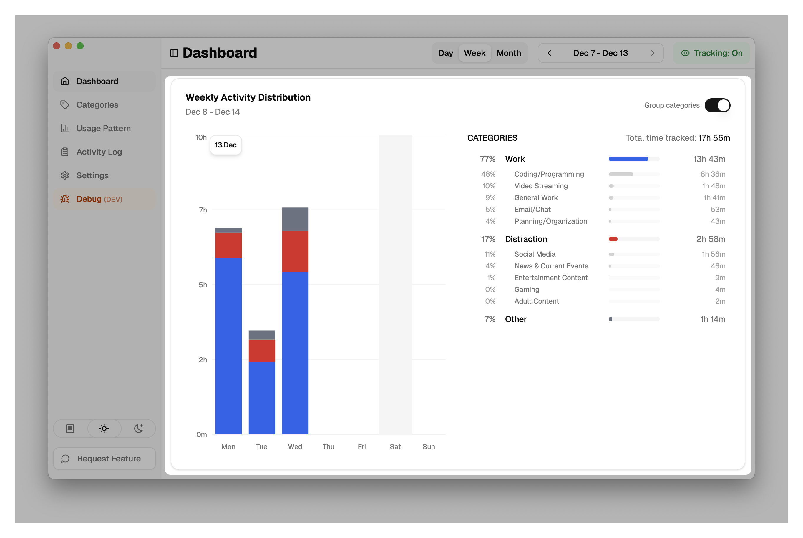
In the Grouped View, categories are aggregated into their parent groups (e.g., "Work", "Entertainment", "Communication"). This gives you a high-level overview of your focus areas.
Ungrouped View
By toggling "Group categories" off, you switch to the Ungrouped View, which breaks down time by individual categories (e.g., "Coding", "Social Media", "Email").

Metrics Explained
1. Daily Distribution (Bar Chart)
- Daily Bars: Each bar represents a day of the week.
- Stacked Categories: The bars are stacked with colors corresponding to your categories or groups. The height of each color segment represents the time spent in that category for that day.
- Total Daily Time: The total height of the bar indicates the total tracked time for that day.
2. Category Breakdown
The side panel provides a summary for the entire week selected.
- Total Time Tracked: The sum of all activity for the week.
- List: Categories (or Groups) are listed by total duration.
- Percentage: Shows what portion of your week was spent in each category.
- Duration: Exact time spent (e.g., "12h 30m").
- Visual Bar: A horizontal bar visualizes the proportion of time.
- Sub-category Details: In the grouped view, you can see breakdowns of which specific categories contributed to a group's total.