Day View Metrics
The Day View provides a granular look at your daily activity, breaking down how you spend your time and identifying potential distractions.
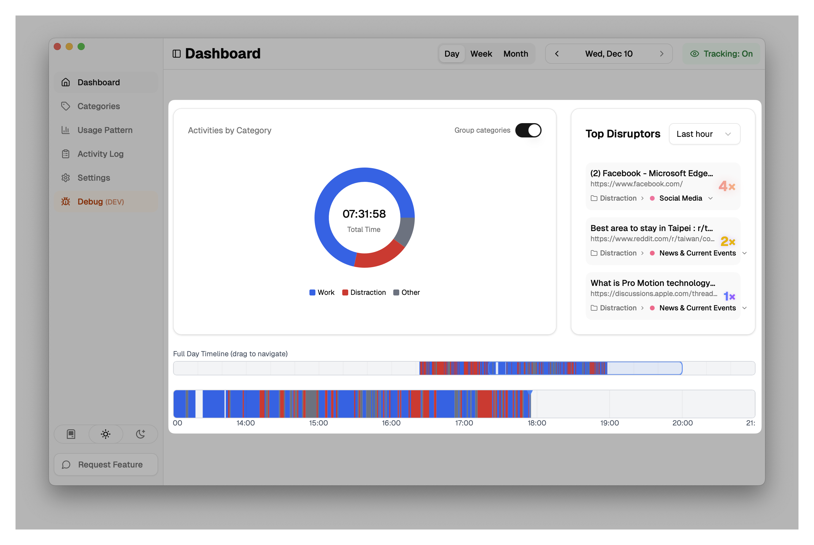
1. Activity Chart (Pie Chart)
The main visual is a donut chart representing either Categories or Category Groups (depending on your "Group categories" toggle).
- Total Time: Displayed in the center of the chart.
- Segments: Each colored segment represents a category or group.
- List View: To the right (or below) the chart, you see a list of these categories sorted by duration.
- Includes the category name, total time spent, and the percentage of your total tracked time.
- Hover Details: Hovering over a category reveals the specific apps or websites that contributed to that category's time.
2. Top Disruptors
This panel highlights the apps and websites you have opened most frequently, which can indicate context switching or multitasking.
- Open Count: Shows how many times you switched to a specific app or site.
- Intensity: Items with higher counts are visually emphasized to draw attention to potential distractions.
- Time Filter: You can filter this view to show disruptors for the "Last hour", "Last 5 hours", or "Today".
- Categorization: Shows the category and group for each disruptor, allowing you to quickly recategorize if needed.
3. Timeline
Located at the bottom of the view, the horizontal timeline shows your activity chronologically throughout the day.
- Blocks: Colored blocks represent contiguous periods of activity.
- Gaps: Empty spaces indicate time where no activity was tracked (e.g., away from computer).